Rebuilt Vola's pricing page to sell, not just to exist
Rebuilt Vola's pricing page to sell, not just to exist
Vola's pricing page had 5 conversion leaks. I closed them. Then added the selling point that makes the plan an obvious yes!
Travel
B2C
Mobile - Responsive
Jan 2026
UX/UI Design

Adrian Radulescu
TL;DR
Vola is the most trusted online travel agency in Romania. Nine out of ten Romanian travellers know the brand, and over 350,000 people search flights there every month.
They built a subscription, UPGRADE and UPGRADE Plus, and the page for it was ready to launch but not ready to sell. Their designer had his hands full, so they brought me in.
I found five conversion leaks on the first scroll, closed them, and added one selling point of my own. The page is live and has run six months without a redesign call.

TL;DR
Vola is the most trusted online travel agency in Romania. Nine out of ten Romanian travellers know the brand, and over 350,000 people search flights there every month.
They built a subscription, UPGRADE and UPGRADE Plus, and the page for it was ready to launch but not ready to sell. Their designer had his hands full, so they brought me in.
I found five conversion leaks on the first scroll, closed them, and added one selling point of my own. The page is live and has run six months without a redesign call.
The goal
Three goals, in that order. A page built to convert, because this is a subscription and a subscription page either earns its keep or it does not.
Second, a page that feels like Vola. Playful and still professional, the same voice nine out of ten Romanian travellers already recognise.
Third, mobile first, because that is where their customers are. Every decision on this page was made for a thumb and then adapted upward.
The plan
No analytics, no time for user testing. So I designed for conversion the way you do without data: find the problems, rank them by what each one costs, fix them with patterns that already work.
Strategy. I locked the direction with their team first. Convert, sound like Vola, work on a phone.
Feasibility. I read their design library and the live product, so what I drew could actually be built inside their world.
Research. Their visual language was set, so my research went into which patterns convert best for each problem I found.
Ideation. I opened the prototype like a first time visitor and marked every problem on the first pass. AI widened the search, and I made every call.
Design and handoff. First iteration, sync, calibrate, final version. I handed it over with the reasoning attached, so every decision arrived with its argument.
The problems, top to bottom
We are in the ideation phase now. I scrolled it the way a customer would, and here is what hit me, in order.
1. Above the fold
Text that told me nothing new and two buttons chasing the same action. No reason to scroll, and everything this page sells lives below.

2. The subscription table - First priority
A side by side table makes the two plans fight each other, when the real comparison is life with a plan against life without one.

3. Competing buttons - Next in line
Join Upgrade Plus sits next to Join Upgrade, two buy buttons competing for the same thumb, and the pair appears twice on the page.

4. The savings section - Next in line
Good idea, expensive execution. One full static screen showing savings per trip, and every new benefit would stretch it further.

5. Testimonials - Last on the list
A name, a plan, a date, a block of text. Proof that makes you read every word before it lands is proof most people skip.

The pushback
I sent the first iteration expecting an argument. Their team came back with two different kinds of it.
Where I folded. My tooltips broke their design language, which puts details in bottom sheets. I moved the benefit details into a modal, and it reads better there.
Where I held. They said the plan selector was not obvious enough. I made it louder instead of softer, with a bigger tap target and a clearer selected state.
Two rounds later the page was better than either first draft. That is what pushback is for.

The fixes, top to bottom
One decision runs through the whole page. Single column wherever possible, so it reads naturally on a phone.
Text sits left aligned rather than centered. A straight left edge gives the eye one place to return to on every line.
The above the fold section
I let a slice of the next section sit at the bottom edge of the screen. A cut off element reads as continuation, so the eye keeps moving without being told to scroll.
Then I cut the two competing buttons down to one. Two buttons with the same intent split the decision and slow the tap, and a single action removes the choice entirely.
I rewrote the copy to say what the subscription does for you, playful but still professional. The first screen has one job, which is earning the scroll.

The plans
I turned the table into one card per plan. Name, price, benefits, one button, so each plan is read on its own instead of scanned against the other.
Cards alone read like a price tag with nothing human on them. I gave each one a line naming who the plan is for, so you find yourself in a sentence rather than decoding a grid.
The Plus card repeated everything from the cheaper tier, so I cut it to what is new. And I added cancel anytime, because naming the exit lowers the risk a buyer feels right before the click.

The savings section
The two plans differ mainly on three free date changes a year. I put the calculator on a plan selector, so you pick a plan and see your own number instead of a generic one.
The breakdown took a full screen for how little it decides. I moved it under a tap, following progressive disclosure: show the answer, keep the fine print until someone asks for it.
The saved amount lands first and does the persuading. The number hooks, the details confirm

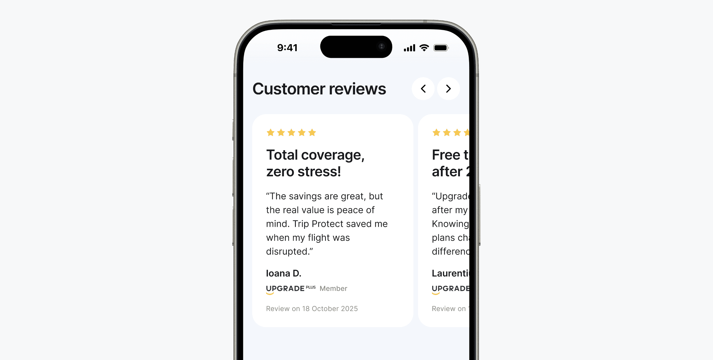
The testimonials
I rebuilt them to be read in half a second. Five stars sit at the top, so the verdict lands before anyone reads a word.
Each one got a short title carrying the point, so the paragraph becomes optional rather than required. I added the plan logo, so it reads as a real customer on a real plan.
Where the math starts being obvious
Nobody believes a number just because it is on the screen. Save money is what every scam says too, so people read a savings figure looking for the catch.
So I went and found reasons to believe it. US surveys put frequent flyers at three or more trips a year, EU numbers land in the same range, and 20 friends who fly on holiday averaged above three.
That became one callout bubble after the savings section, saying most travellers book three to five trips a year. It is the hardest working element on the page, because it turns my number into their arithmetic.

The outcome
They built it. The page is live right now at https://www.vola.ro/upgrade. Six months in production, and nobody has been brought in to redesign it.
Vola went further and started duplicating the page for partnerships, including a co-branded version inside George, BCR's banking app. I designed products inside George two jobs ago.
Almost everything shipped as drawn. The peek, the cards, the single action per card, the calculator, the testimonials, and the callout bubble are all live.
Two things changed. The Plus card kept its full bullet list where I had trimmed it, and the calculator lost the tap to expand. Their product, their call.

What I would do next
The page works, and that is the baseline rather than the finish. A live page is the best research tool available, and right now nobody is reading it.
Find where people leave. Scroll depth and session recordings first. Anyone who exits before the callout bubble never saw the strongest argument on the page.
Watch the calculator. It is the engine. If people who touch the plan selector convert more, pull it higher. If they do not, something else is doing the selling.
Talk to the people who almost bought. Five short interviews with visitors who reached the cards and left. The page answers the questions I predicted, not the ones I missed.
Test the price framing. Yearly price, price per trip, or pays for itself in one booking. Same number, three different stories, and the buyer only hears one first.
Follow the buyers past the click. Signups are half the number. A subscription that converts but does not renew is a refund queue with a delay.
What this means for your team
One scroll found five problems. One handoff fixed them, and the page has run six months without a redesign call.
They asked for a page that felt less boring. I read the brief as a conversion problem and designed for that instead.
No analytics and no testing budget, and I still ranked every problem by what it was costing. That ranking is the part that matters, and that part is mine.
I read the design library before I draw, so what I hand over gets built rather than admired. Almost every decision here shipped exactly as designed.
Give me your product and the data I did not have here. I will tell you where I would start.

The goal
Three goals, in that order. A page built to convert, because this is a subscription and a subscription page either earns its keep or it does not.
Second, a page that feels like Vola. Playful and still professional, the same voice nine out of ten Romanian travellers already recognise.
Third, mobile first, because that is where their customers are. Every decision on this page was made for a thumb and then adapted upward.
The plan
No analytics, no time for user testing. So I designed for conversion the way you do without data: find the problems, rank them by what each one costs, fix them with patterns that already work.
Strategy. I locked the direction with their team first. Convert, sound like Vola, work on a phone.
Feasibility. I read their design library and the live product, so what I drew could actually be built inside their world.
Research. Their visual language was set, so my research went into which patterns convert best for each problem I found.
Ideation. I opened the prototype like a first time visitor and marked every problem on the first pass. AI widened the search, and I made every call.
Design and handoff. First iteration, sync, calibrate, final version. I handed it over with the reasoning attached, so every decision arrived with its argument.
The problems, top to bottom
We are in the ideation phase now. I scrolled it the way a customer would, and here is what hit me, in order.
1. Above the fold
Text that told me nothing new and two buttons chasing the same action. No reason to scroll, and everything this page sells lives below.
2. The subscription table - First priority
A side by side table makes the two plans fight each other, when the real comparison is life with a plan against life without one.
3. Competing buttons - Next in line
Join Upgrade Plus sits next to Join Upgrade, two buy buttons competing for the same thumb, and the pair appears twice on the page.
4. The savings section - Next in line
Good idea, expensive execution. One full static screen showing savings per trip, and every new benefit would stretch it further.
5. Testimonials - Last on the list
A name, a plan, a date, a block of text. Proof that makes you read every word before it lands is proof most people skip.
The pushback
I sent the first iteration expecting an argument. Their team came back with two different kinds of it.
Where I folded. My tooltips broke their design language, which puts details in bottom sheets. I moved the benefit details into a modal, and it reads better there.
Where I held. They said the plan selector was not obvious enough. I made it louder instead of softer, with a bigger tap target and a clearer selected state.
Two rounds later the page was better than either first draft. That is what pushback is for.
The fixes, top to bottom
One decision runs through the whole page. Single column wherever possible, so it reads naturally on a phone.
Text sits left aligned rather than centered. A straight left edge gives the eye one place to return to on every line.
The above the fold section
I let a slice of the next section sit at the bottom edge of the screen. A cut off element reads as continuation, so the eye keeps moving without being told to scroll.
Then I cut the two competing buttons down to one. Two buttons with the same intent split the decision and slow the tap, and a single action removes the choice entirely.
I rewrote the copy to say what the subscription does for you, playful but still professional. The first screen has one job, which is earning the scroll.
The plans
I turned the table into one card per plan. Name, price, benefits, one button, so each plan is read on its own instead of scanned against the other.
Cards alone read like a price tag with nothing human on them. I gave each one a line naming who the plan is for, so you find yourself in a sentence rather than decoding a grid.
The Plus card repeated everything from the cheaper tier, so I cut it to what is new. And I added cancel anytime, because naming the exit lowers the risk a buyer feels right before the click.
The savings section
The two plans differ mainly on three free date changes a year. I put the calculator on a plan selector, so you pick a plan and see your own number instead of a generic one.
The breakdown took a full screen for how little it decides. I moved it under a tap, following progressive disclosure: show the answer, keep the fine print until someone asks for it.
The saved amount lands first and does the persuading. The number hooks, the details confirm
The testimonials
I rebuilt them to be read in half a second. Five stars sit at the top, so the verdict lands before anyone reads a word.
Each one got a short title carrying the point, so the paragraph becomes optional rather than required. I added the plan logo, so it reads as a real customer on a real plan.
Where the math starts being obvious
Nobody believes a number just because it is on the screen. Save money is what every scam says too, so people read a savings figure looking for the catch.
So I went and found reasons to believe it. US surveys put frequent flyers at three or more trips a year, EU numbers land in the same range, and 20 friends who fly on holiday averaged above three.
That became one callout bubble after the savings section, saying most travellers book three to five trips a year. It is the hardest working element on the page, because it turns my number into their arithmetic.
The outcome
They built it. The page is live right now at https://www.vola.ro/upgrade. Six months in production, and nobody has been brought in to redesign it.
Vola went further and started duplicating the page for partnerships, including a co-branded version inside George, BCR's banking app. I designed products inside George two jobs ago.
Almost everything shipped as drawn. The peek, the cards, the single action per card, the calculator, the testimonials, and the callout bubble are all live.
Two things changed. The Plus card kept its full bullet list where I had trimmed it, and the calculator lost the tap to expand. Their product, their call.
What I would do next
The page works, and that is the baseline rather than the finish. A live page is the best research tool available, and right now nobody is reading it.
Find where people leave. Scroll depth and session recordings first. Anyone who exits before the callout bubble never saw the strongest argument on the page.
Watch the calculator. It is the engine. If people who touch the plan selector convert more, pull it higher. If they do not, something else is doing the selling.
Talk to the people who almost bought. Five short interviews with visitors who reached the cards and left. The page answers the questions I predicted, not the ones I missed.
Test the price framing. Yearly price, price per trip, or pays for itself in one booking. Same number, three different stories, and the buyer only hears one first.
Follow the buyers past the click. Signups are half the number. A subscription that converts but does not renew is a refund queue with a delay.
What this means for your team
One scroll found five problems. One handoff fixed them, and the page has run six months without a redesign call.
They asked for a page that felt less boring. I read the brief as a conversion problem and designed for that instead.
No analytics and no testing budget, and I still ranked every problem by what it was costing. That ranking is the part that matters, and that part is mine.
I read the design library before I draw, so what I hand over gets built rather than admired. Almost every decision here shipped exactly as designed.
Give me your product and the data I did not have here. I will tell you where I would start.
Start a project
You made it this far.
Let's talk!
You made it this far.
Let's talk!
I've designed banking flows, quoting engines, and docs platforms used by 3,000+ companies.
Whatever you're building, it lands in good hands.
Location
Remote / Bucharest, Romania
radulescu.adrian17@gmail.com
Phone
+40 785 752 708


