ReviurFit, redesigned the way I'd fix a client's product
ReviurFit, redesigned the way I'd fix a client's product
My first app in 2021. My skills in 2023. My vision for it in 2026. One product, three versions of the designer.
Fitness
B2C
Mobile
August 2021 / March 2023
Product Designer

Adrian Radulescu
TL;DR
Reviur Fit is a health and wellness app. Articles, recipes, exercises, and nutrition facts, matched to what you are trying to do.
It is a personal project, not a live product. I say that up front, because how a designer works when nobody is paying tells you more than another client logo.
Three chapters. I built it in 2021 as a student, rebuilt it in 2023 while working at BCR and HP, and in 2026 I stopped asking how it looks.
Read the full visual case study for this project: https://drive.google.com/file/d/1Fzj8tRqlbevq8qQavcotevOb53N-D2xV/view?usp=sharing
2021, the users won every argument
I built the first version for the Google UX certificate. No client, no engineers, no analytics, and nobody to argue with except the people I interviewed.
I ran interviews and empathy mapping, then built personas and a journey map where every dip became a work item. Paper wireframes first, five sketches per screen, then a clickable prototype.
Two groups came out of the research. People building habits to lose weight, and people already healthy who wanted to go deeper.


What testing broke
Round one said filters were confusing, navigation and settings were tangled, and finding an article took too long. Round two said the nav bar was hard to see and the filters still were not right.
I redesigned instead of defending. Settings got their own button, filters got categories and a done button, and the flow finally had a shape.
I put Summary and Full article side by side at the moment you choose. Most people opening a health article do not want the article, they want the answer.

Where 2021 ended
A working prototype backed by real research and two rounds of testing. The thinking was right and the craft was not.
Every screen was drawn by hand, nothing scaled, and the app was missing everything a real product cannot ship without.
2023, I became my own client
Two years later I was designing banking flows at BCR and configuration screens inside HP's quoting platform. I opened the old file and treated it like any inherited product.
Walk into something that already exists, design new things on it, redesign what needs it. The 2021 app was the client and the 2023 designer was the hire.
What I changed, biggest first
One design system. I rebuilt everything on Moon, a public library of tested components. Buttons and inputs are already solved, and redrawing them costs a week that belongs to the search instead.
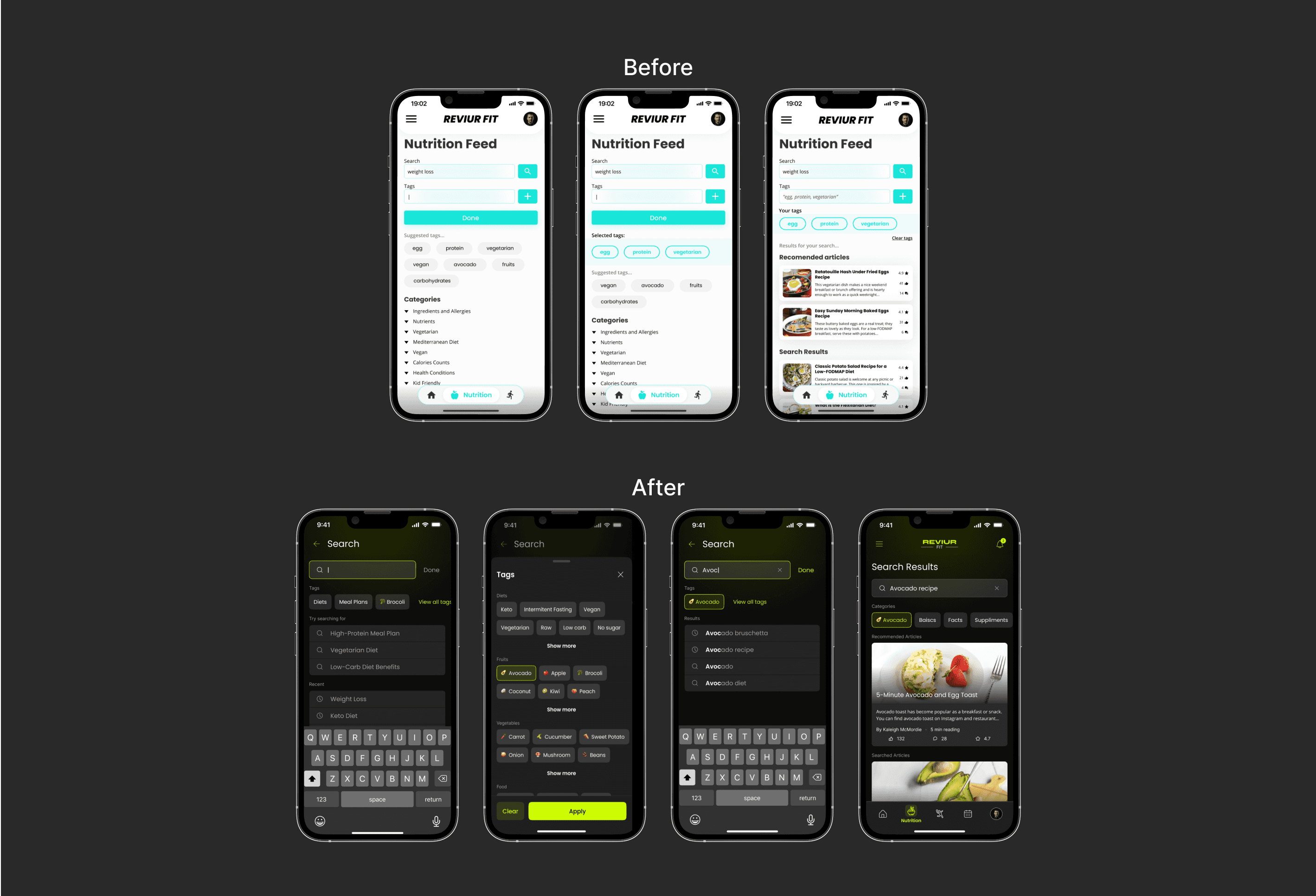
Search built on recognition. People are far better at picking from options than remembering the right word. Every tag got an emoji, because the eye finds the picture before the word.
Sign up, one question per screen. Personalisation moved inside sign up, while motivation is highest, so the app is already shaped to you the first time it opens.
2021 | 2023 | |
|---|---|---|
Components | Drawn by hand | Moon Design System |
Palette | Turquoise on white | Near black + spring green |

The rest of what a product needs
Errors that name what happened and what to do next, so the screen reads as control rather than panic.
Onboarding, comments under articles, audio playback because the gym keeps your hands busy, and a profile page that makes the personalisation visible.
None of those is impressive alone. Together they are the difference between a course project and a product.
Search built on recognition, not recall
People opening a health app rarely know the exact word for what they want. Typing it means remembering the right term first, and most give up scanning a long undifferentiated list.
I rebuilt search around patterns people already know from every other app, so they pick from options instead of recalling a word. Every tag got an emoji, because the eye finds the picture before the word, and you search your slice of the library rather than all of it.
Sign up, one question per screen
The old app had no real sign up. A wall of fields at the front asks for the most effort at the exact moment a person knows the least about why it is worth it.
I split it into one question per screen and moved personalisation inside, so goals and measurements get collected while motivation is highest. Login with Google, Facebook, and Apple removes fields, and I accepted more screens on purpose, because a short form people abandon is slower than a long one they finish.

Errors that read as control, not panic
An error screen that dumps everything at once tells a person something is wrong without telling them what to do. They read it as a wall rather than a step, and they leave.
I built the error states on progressive disclosure, which means showing the important part first and keeping the detail for when it is asked for. Each one names what happened, then what to do next, so the person stays in control of the flow.

The parts a product cannot skip
The 2021 app was only the happy path. It dropped you straight in with no introduction, no way to reply to anything, and no visible sign that it had been shaped to you.
I added onboarding so the app explains itself, comments under articles, audio playback because the gym keeps your hands busy, and a profile page that makes the personalisation visible. None of those is impressive alone, and together they are the difference between a course project and a product.

The Events page
One line sat buried in a persona's frustrations. Simona could not work out with friends, and I read it in 2021 and moved on.
More articles do not fix what actually breaks a healthy habit, which is doing it alone. I designed the Events page so people join sporting events or create their own, which came from rereading old research rather than a test failure. Content gets read once, and people come back for people.

Where the argument was with me
In 2021 the users pushed back. In 2023 nobody did, so the only critic was the person who made it, and that is the harder version.
I kept the 2021 research, personas, and core promise, because trashing your early thinking to look smarter is insecurity rather than growth.
Patching the flagged screens would have been enough and nobody would have known. I refused, and that call cost me every screen in the app.
2026, stop polishing and ask what it is for
The app helps people find the right answer. It does nothing about the gap between knowing what to do and doing it, and that gap is where healthy habits die.
AI should sit underneath the whole product. Ask a question in a sentence, fact check the content, build recipes from what is in your fridge. 2021 gave people a search bar, 2023 made it fast, and 2026 should answer.
Social is the obvious next move and the easy trap. Push competition too hard and it becomes a leaderboard for people already fit, which loses the beginner I built it for.
What I would fix in my own work
Move everything into thumb reach, because phones got taller and my layout never noticed. Label the nav icons, since icons alone make people guess.
The main page should become a feed of the people and topics you follow, for the same reason the Events page exists.
The hard part is not the ideas, and I just listed ten. It is picking which ones matter, what they cost, and who they lose if I get it wrong..
Read the full visual case study for this project: https://drive.google.com/file/d/1Fzj8tRqlbevq8qQavcotevOb53N-D2xV/view?usp=sharing

TL;DR
Reviur Fit is a health and wellness app. Articles, recipes, exercises, and nutrition facts, matched to what you are trying to do.
It is a personal project, not a live product. I say that up front, because how a designer works when nobody is paying tells you more than another client logo.
Three chapters. I built it in 2021 as a student, rebuilt it in 2023 while working at BCR and HP, and in 2026 I stopped asking how it looks.
Read the full visual case study for this project: https://drive.google.com/file/d/1Fzj8tRqlbevq8qQavcotevOb53N-D2xV/view?usp=sharing
2021, the users won every argument
I built the first version for the Google UX certificate. No client, no engineers, no analytics, and nobody to argue with except the people I interviewed.
I ran interviews and empathy mapping, then built personas and a journey map where every dip became a work item. Paper wireframes first, five sketches per screen, then a clickable prototype.
Two groups came out of the research. People building habits to lose weight, and people already healthy who wanted to go deeper.
What testing broke
Round one said filters were confusing, navigation and settings were tangled, and finding an article took too long. Round two said the nav bar was hard to see and the filters still were not right.
I redesigned instead of defending. Settings got their own button, filters got categories and a done button, and the flow finally had a shape.
I put Summary and Full article side by side at the moment you choose. Most people opening a health article do not want the article, they want the answer.
Where 2021 ended
A working prototype backed by real research and two rounds of testing. The thinking was right and the craft was not.
Every screen was drawn by hand, nothing scaled, and the app was missing everything a real product cannot ship without.
2023, I became my own client
Two years later I was designing banking flows at BCR and configuration screens inside HP's quoting platform. I opened the old file and treated it like any inherited product.
Walk into something that already exists, design new things on it, redesign what needs it. The 2021 app was the client and the 2023 designer was the hire.
What I changed, biggest first
One design system. I rebuilt everything on Moon, a public library of tested components. Buttons and inputs are already solved, and redrawing them costs a week that belongs to the search instead.
Search built on recognition. People are far better at picking from options than remembering the right word. Every tag got an emoji, because the eye finds the picture before the word.
Sign up, one question per screen. Personalisation moved inside sign up, while motivation is highest, so the app is already shaped to you the first time it opens.
2021 | 2023 | |
|---|---|---|
Components | Drawn by hand | Moon Design System |
Palette | Turquoise on white | Near black + spring green |
The rest of what a product needs
Errors that name what happened and what to do next, so the screen reads as control rather than panic.
Onboarding, comments under articles, audio playback because the gym keeps your hands busy, and a profile page that makes the personalisation visible.
None of those is impressive alone. Together they are the difference between a course project and a product.
Search built on recognition, not recall
People opening a health app rarely know the exact word for what they want. Typing it means remembering the right term first, and most give up scanning a long undifferentiated list.
I rebuilt search around patterns people already know from every other app, so they pick from options instead of recalling a word. Every tag got an emoji, because the eye finds the picture before the word, and you search your slice of the library rather than all of it.
Sign up, one question per screen
The old app had no real sign up. A wall of fields at the front asks for the most effort at the exact moment a person knows the least about why it is worth it.
I split it into one question per screen and moved personalisation inside, so goals and measurements get collected while motivation is highest. Login with Google, Facebook, and Apple removes fields, and I accepted more screens on purpose, because a short form people abandon is slower than a long one they finish.
Errors that read as control, not panic
An error screen that dumps everything at once tells a person something is wrong without telling them what to do. They read it as a wall rather than a step, and they leave.
I built the error states on progressive disclosure, which means showing the important part first and keeping the detail for when it is asked for. Each one names what happened, then what to do next, so the person stays in control of the flow.
The parts a product cannot skip
The 2021 app was only the happy path. It dropped you straight in with no introduction, no way to reply to anything, and no visible sign that it had been shaped to you.
I added onboarding so the app explains itself, comments under articles, audio playback because the gym keeps your hands busy, and a profile page that makes the personalisation visible. None of those is impressive alone, and together they are the difference between a course project and a product.
The Events page
One line sat buried in a persona's frustrations. Simona could not work out with friends, and I read it in 2021 and moved on.
More articles do not fix what actually breaks a healthy habit, which is doing it alone. I designed the Events page so people join sporting events or create their own, which came from rereading old research rather than a test failure. Content gets read once, and people come back for people.
Where the argument was with me
In 2021 the users pushed back. In 2023 nobody did, so the only critic was the person who made it, and that is the harder version.
I kept the 2021 research, personas, and core promise, because trashing your early thinking to look smarter is insecurity rather than growth.
Patching the flagged screens would have been enough and nobody would have known. I refused, and that call cost me every screen in the app.
2026, stop polishing and ask what it is for
The app helps people find the right answer. It does nothing about the gap between knowing what to do and doing it, and that gap is where healthy habits die.
AI should sit underneath the whole product. Ask a question in a sentence, fact check the content, build recipes from what is in your fridge. 2021 gave people a search bar, 2023 made it fast, and 2026 should answer.
Social is the obvious next move and the easy trap. Push competition too hard and it becomes a leaderboard for people already fit, which loses the beginner I built it for.
What I would fix in my own work
Move everything into thumb reach, because phones got taller and my layout never noticed. Label the nav icons, since icons alone make people guess.
The main page should become a feed of the people and topics you follow, for the same reason the Events page exists.
The hard part is not the ideas, and I just listed ten. It is picking which ones matter, what they cost, and who they lose if I get it wrong..
Read the full visual case study for this project: https://drive.google.com/file/d/1Fzj8tRqlbevq8qQavcotevOb53N-D2xV/view?usp=sharing
Start a project
You made it this far.
Let's talk!
You made it this far.
Let's talk!
I've designed banking flows, quoting engines, and docs platforms used by 3,000+ companies.
Whatever you're building, it lands in good hands.
Location
Remote / Bucharest, Romania
radulescu.adrian17@gmail.com
Phone
+40 785 752 708


